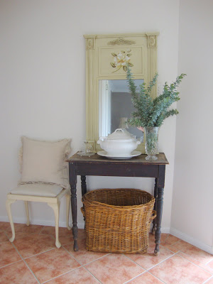
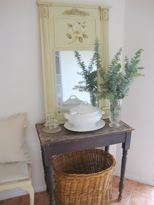
I keep changing what I have at my entry but thought this look was quite simple. I was inspired by Tina over at http://therubieplace.blogspot.com/ to do something with this space. I love this mirror but I am not sure about the hand painted flower think it looks too folk arty to me. I like the pale green colour but think the flower has to go. I could always paint the whole thing white I guess.


Tina
Wow Sandy – your entry hall looks amazing! I love the mirror and don't think the flower looks to folk arty. You could always paint it with a scandinavian grey whitewash for a neutral look. Thanks so much for your kind words re: my entry – you are so sweet!! Loving your makeover, as I do the rest of your beautiful home:) Have a lovely day – Tina x
Anna
Hi Sandy,
Love your arrangement..and I dont think in this case the flower looks too folk artsy ..although I do know what you mean. But it works well here.
And I love the colour of the mirror..dont paint it white this looks very vintage ..its perfect.
You could always paint over the flower and add a quote or welcome message…you know like..Home is were the heart is…although that's too predictable.but you know what I mean..lol
Vanilla Press
Hi there, your entrance way looks fab.
Very welcoming
Alison Gibbs
The entry looks fabulous. maybe you could put a vintage or black and white photo in the space where the flower is painted. Maybe put it on with blutak and change it over every now and then
Alison
Lil
Hi Sandy,
think that Tina´s idea is a very good idea.
Feels that something is not absolutely perfect in the arrangement of the entry already. Scandinavian grey whitewash sounds good (hope that it means what i figure).
In Germany many women are "breathless" readers of a blog called "White and Shabby". The wonderful Jade lives in Bavaria and seems to create white-arrangements no one ever would have thought to be possible.
I radically would paint the mirror, the chair and the floor in white………… sometimes I´m so radical 🙂
Greetings
Lil
Beach Vintage
Oh Sandy, I really need to work on my entry. Thanks for the inspiration.
kanishk
you know like..Home is were the heart is…although that's too predictable.but you know what I mean.
Work from home India
KAREN
GOOD MORNING, SANDY,
YOUR NEW LOOK IN THE FOYER LOOKS GREAT AND I LOVE THE MIRROR JUST LIKE IT IS!! BUT, IF YOU WOULD LIKE TO CHANGE THE PAINTED FLOWER, YOU COULD JUST PAINT IN THE LITTLE BOX WHERE IT RESIDES OR MAYBE A LOVELY BIT OF WALLPAPER COULD BE USED. THANKS FOR YOUR POST. I CHECK IT EVERYDAY AND SINCE I LIVE IN SOUTH GEORGIA, USA, OUR SEASONS ARE OPPOSITE OF EACH OTHER, WHICH REALLY MAKES YOUR POST A LOT OF FUN!! KEEP DECORATING – YOU ARE GREAT AT IT!!
KAREN
Rie
I love your blog! Very inspirational. I hope you'll check out my kitchen reveal on my blog. It's modern country with a swedish flair. http://homeandharmony.blogspot.com/
Creative in Chicago
Great work. I am working on my entry hall too.
Entry hall makeover